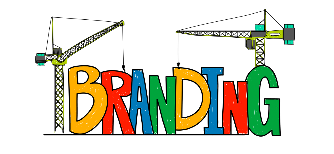
A new logo. A fresh color palette. A sleek new tagline.
That’s how most rebrands look on the surface — but it’s not what rebranding truly is.
Because rebranding isn’t cosmetic. It’s surgical.
Done right, it’s a deep identity shift — a declaration of who you are now, what’s changed, and what you’re unapologetically standing for moving forward.
And yet… most rebrands flop.
Not because the visuals were bad.
But because the truth behind them was missing.
The Real Reason Rebrands Fail
Rebrands don’t fail because the design wasn’t trendy enough.
They fail because they lacked courage.
Here’s what that usually looks like:
- No clear reason for the rebrand (aesthetic boredom is not a strategy)
- Trying to please everyone instead of aligning with a bold new direction
- Fixating on the visuals while ignoring the voice, culture, and customer experience
- Forgetting the audience — and making it all about internal preferences
The result? A brand that looks shiny on the outside but feels empty on the inside. And in today’s authenticity-obsessed world, emptiness doesn’t sell.
What Rebrands Are Actually For
A rebrand should never be a knee-jerk reaction to FOMO or “we need to modernize.”
It should be a response to a truth:
- Your audience has evolved.
- Your values have sharpened.
- Your mission has matured.
- Or, sometimes, your past identity no longer fits the business you’ve become.
Rebranding is not an update. It’s a reset.
A moment of brave, intentional alignment with who you really are — and what you really want to be known for.
The Brave Ones: Who Got It Right and Why
Let’s talk about the few who dared differently — and won.
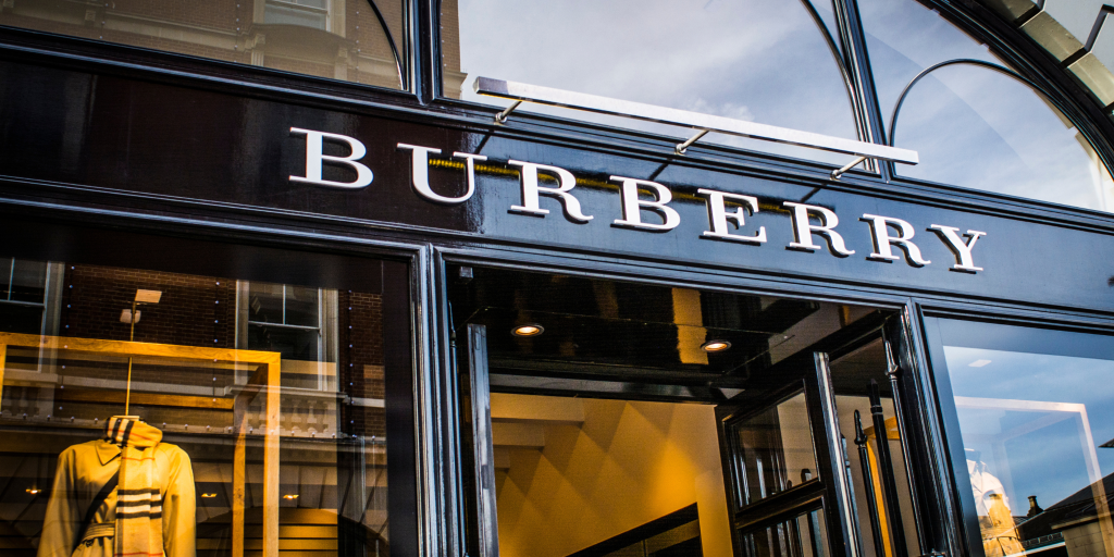
Burberry
From being a luxury relic to a Gen Z streetwear statement, Burberry didn’t just update its visuals — it transformed its brand culture. Through storytelling, ambassador selection, and campaign art direction, the brand became fashion-forward without forgetting its legacy.
Airbnb
The launch of the “Bélo” wasn’t just a new logo. It was a symbol of belonging. Airbnb redefined its purpose — from renting homes to creating global connections — and made sure every visual, copy, and product experience reinforced that shift.
Instagram (2016)
Everyone hated the flat gradient logo at first. But Instagram wasn’t trying to make people comfortable — they were making space for what was coming: stories, creators, and color-forward expression. It was a rebrand made for tomorrow, not yesterday.
What did they all share?
Clarity. Vision. Emotional resonance. And the guts to stand by it.
How to Rebrand with Courage (and Not Regret)
At Pixmagnate Works, we often tell clients:
“Don’t rebrand to look better. Rebrand to be clearer.”
So if you’re considering a rebrand, ask yourself:
- What is the emotional shift we want people to feel?
- What truths are we ready to speak now — that we once avoided?
- What do we need to leave behind (yes, even if it’s nostalgic)?
- Are we designing for real humans — or internal egos?
Because brave brands don’t just repaint the walls. They remodel the foundation.
And they design for meaning, not just memorability.
Final Take
Most rebrands fail because they try to fix perception without fixing purpose.
But the bold ones?
They’re willing to say:
“We’re not who we used to be — and that’s a good thing.”
So go ahead. Change the logo. Switch the palette. Redraw the brand.
Just don’t do it to impress.
Do it to tell the truth.