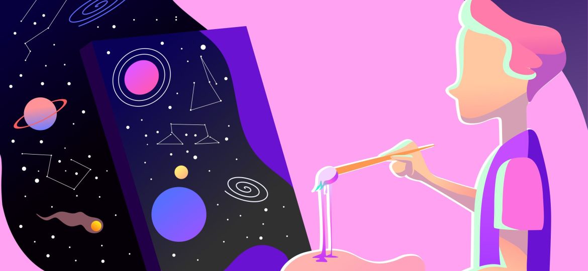
Some brands get noticed. Others get chosen.
In a world flooded with design, it’s no longer about how good something looks — it’s about how well it feels. People don’t read brands. They feel them. And that feeling is shaped, guided, and triggered through design.
This is the quiet power behind visual strategy. When done right, design becomes a decision-making tool. Every color, every button, every layout element carries psychological weight. It can either create flow or friction. Connection or confusion. A click or a scroll-past.
Let’s dive into the psychology of smart visual design, and how brands that understand it are shaping not just perception — but behavior.
Design Is a Language. And Emotion Is Its Grammar.
Good design doesn’t explain. It evokes.
Before a word is read or a headline is processed, your audience already feels something. Color palettes set tone. White space gives breath. Fonts carry personality. All of this happens within milliseconds. That’s not aesthetic. That’s emotion at work.
Take the color blue. In finance, it signals trust. In tech, it signals calm control. In health, it signals cleanliness and clarity. But switch that blue to red, and the energy shifts entirely. Urgency. Passion. Alert.
Design choices aren’t decorative. They’re psychological levers.
Visual Hierarchy: The Silent Guide
Great design doesn’t just look nice. It leads the eye.
Visual hierarchy is how we direct attention. Think of it as the GPS of your interface or brand layout. Headlines, CTAs, imagery, spacing — these elements create a path. A roadmap that says: “Look here first. Feel this next. Do that now.”
When hierarchy is missing, users feel lost. The experience becomes noisy or flat. And when people are overwhelmed, they bounce. That’s not a content issue. It’s a design psychology issue.
Cognitive Load: Make It Easy, or Lose the User
Every extra click, every unclear button, every ambiguous visual — it adds friction. Friction increases cognitive load. And the more mental work a user has to do, the faster they leave.
Smart design removes questions before they’re asked. It anticipates confusion and solves it with clarity. That’s why intuitive navigation, minimalist interfaces, and clear CTA contrasts drive higher engagement. Because users shouldn’t have to think about how to think.
Micro-Interactions, Macro-Impressions
That subtle hover animation. The soft scroll-triggered fade. The satisfying progress bar. These aren’t just flourishes. They are emotional cues.
Micro-interactions create a sense of responsiveness. They humanize the interface. When done right, they tell your user: “You’re in control. We’re listening.”
This kind of responsiveness builds trust. Trust builds confidence. And confidence drives action.
Case in Point: Scroll-Past or Stop-and-Stare?
Consider two landing pages. One is packed with copy, harsh colors, and multiple CTAs fighting for attention. The other uses a clean, focused layout with a single emotional headline, a centered image, and a clear button.
Which one do you stay on?
In multiple A/B tests we’ve conducted for clients, design simplicity with strong emotional triggers consistently outperformed content-heavy layouts. When the design guided the user emotionally and visually, conversions increased by as much as 40%.
Design drives behavior. Not by chance. But by choice.
Design as Trust Builder
Visual consistency is another silent trust builder. Repeating elements, cohesive color schemes, and predictable layouts send a subconscious message: “We’re stable. We’re considered. You can trust us.”
Inconsistent visuals signal chaos or carelessness. Especially for new users, visual design is the first layer of credibility. And that credibility determines whether they stay or bounce.
Design Thinking for Brand Strategy
At Pixmagnate, we approach design with behavioral strategy at the core. We don’t just ask, “How should this look?” We ask, “How should this feel?”
Our work blends aesthetics with intention, because every visual choice is a strategic decision. Whether we’re building landing pages, crafting motion graphics, or shaping full brand systems — the goal is to help your audience feel what you want them to believe.
We believe your design should be more than seen. It should be felt. And it should lead to action, not just admiration.
Conclusion: Design Is a Decision Tool
Design isn’t art. It isn’t decoration. It’s persuasion. It’s navigation. It’s emotion. It’s strategy.
When done well, it doesn’t just attract attention — it guides decisions. That’s why brands that invest in strategic, psychology-backed visual systems perform better. Not because they’re louder, but because they’re clearer, calmer, and more connected.
In a digital world full of noise, smart design isn’t optional. It’s your brand’s most human advantage.
Want design that leads to decisions — not just likes? Let’s collaborate. Pixmagnate turns visuals into velocity.
